

Appearance
Playlist layouts
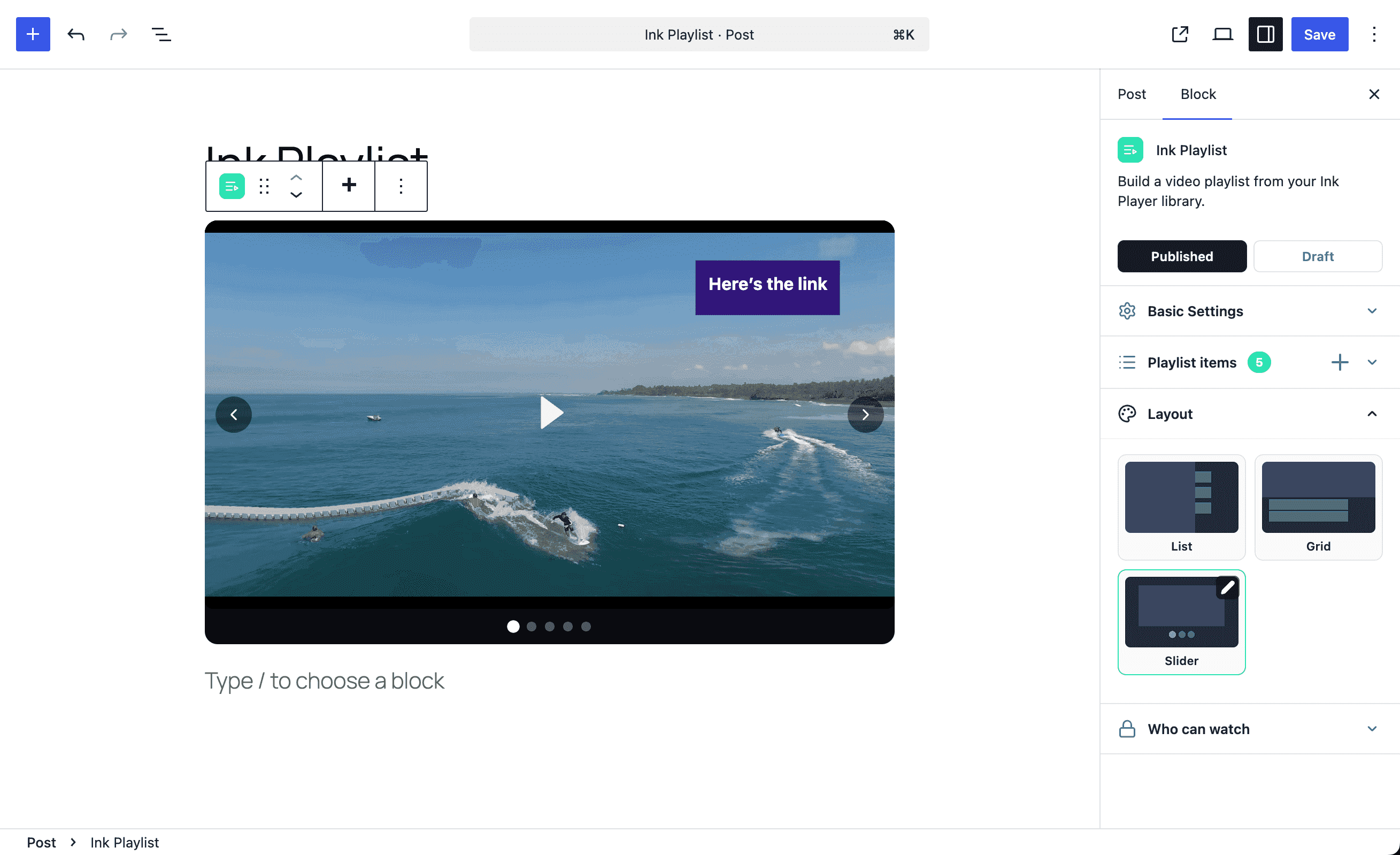
A playlist layout controls how the player and the item list appear together. In the Playlist Editor, open the Layout panel, pick a layout tile, then click its pencil to open the settings drawer for that layout.
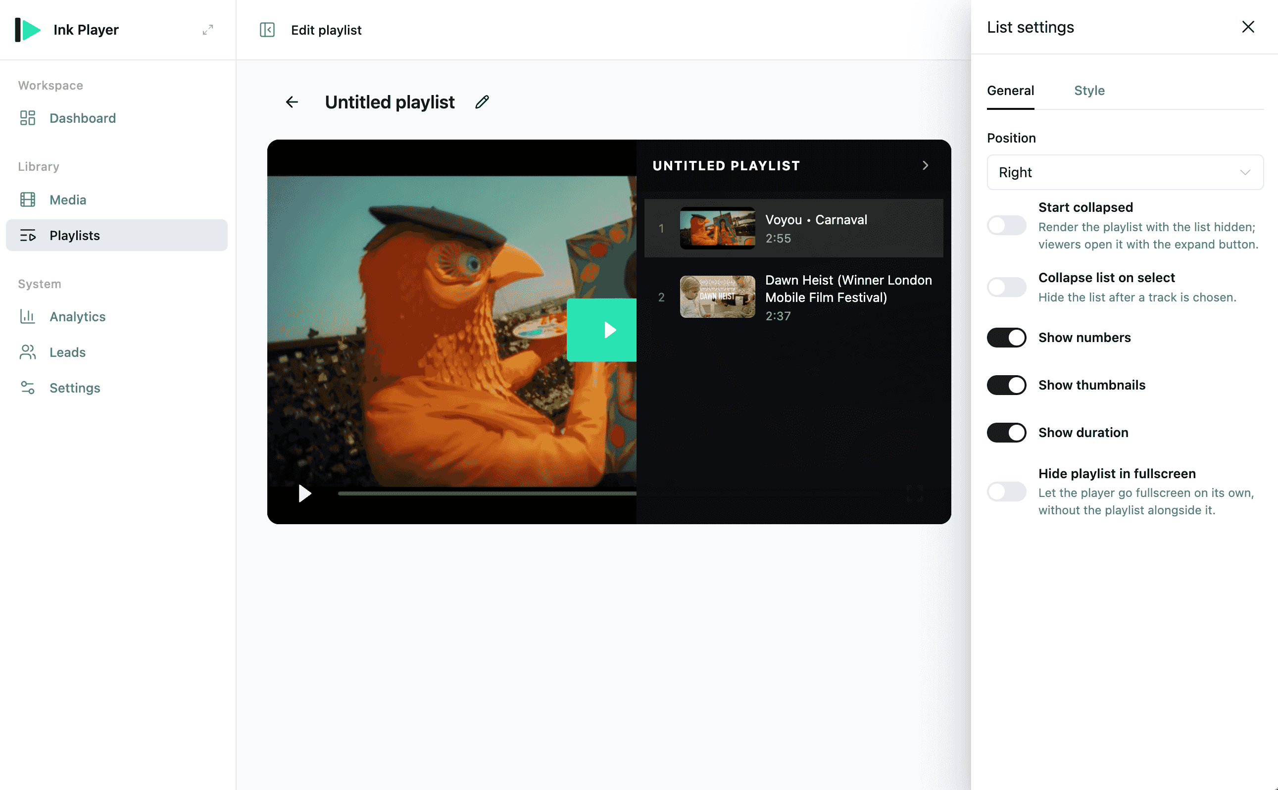
The settings drawer has two tabs — General (position and display options) and Style (colors).
Video playlists offer three layouts — List, Grid, and Slider. Audio playlists always use the List layout (audio plays in a bar, so the list only stacks above or below it).
TIP
Hide playlist in fullscreen is available in every layout's drawer. Turn it on to let the player go fullscreen on its own, without the playlist alongside it.
Video layouts
List
A primary player with a vertical list of items.
| Option | What it does |
|---|---|
| Position | Right, Left, Above player, or Below player. |
| Start collapsed | Renders the list hidden; viewers open it with the expand button. Side positions (Left/Right) only. |
| Collapse list on select | Hides the list after a track is chosen. Side positions (Left/Right) only. |
| Show numbers | Shows the item index in the list. |
| Show thumbnails | Shows each item's poster image. |
| Show duration | Shows each item's length. |
Use a side position only when the content area is wide enough; on narrow screens the list stacks below the player.
Grid
A player with a grid of item cards.
| Option | What it does |
|---|---|
| Position | Below player or Above player. |
| Columns | Number of cards per row, from 2 to 6. |
| Show title | Shows each item's title under its card. |
| Show duration | Shows each item's length. |
Slider
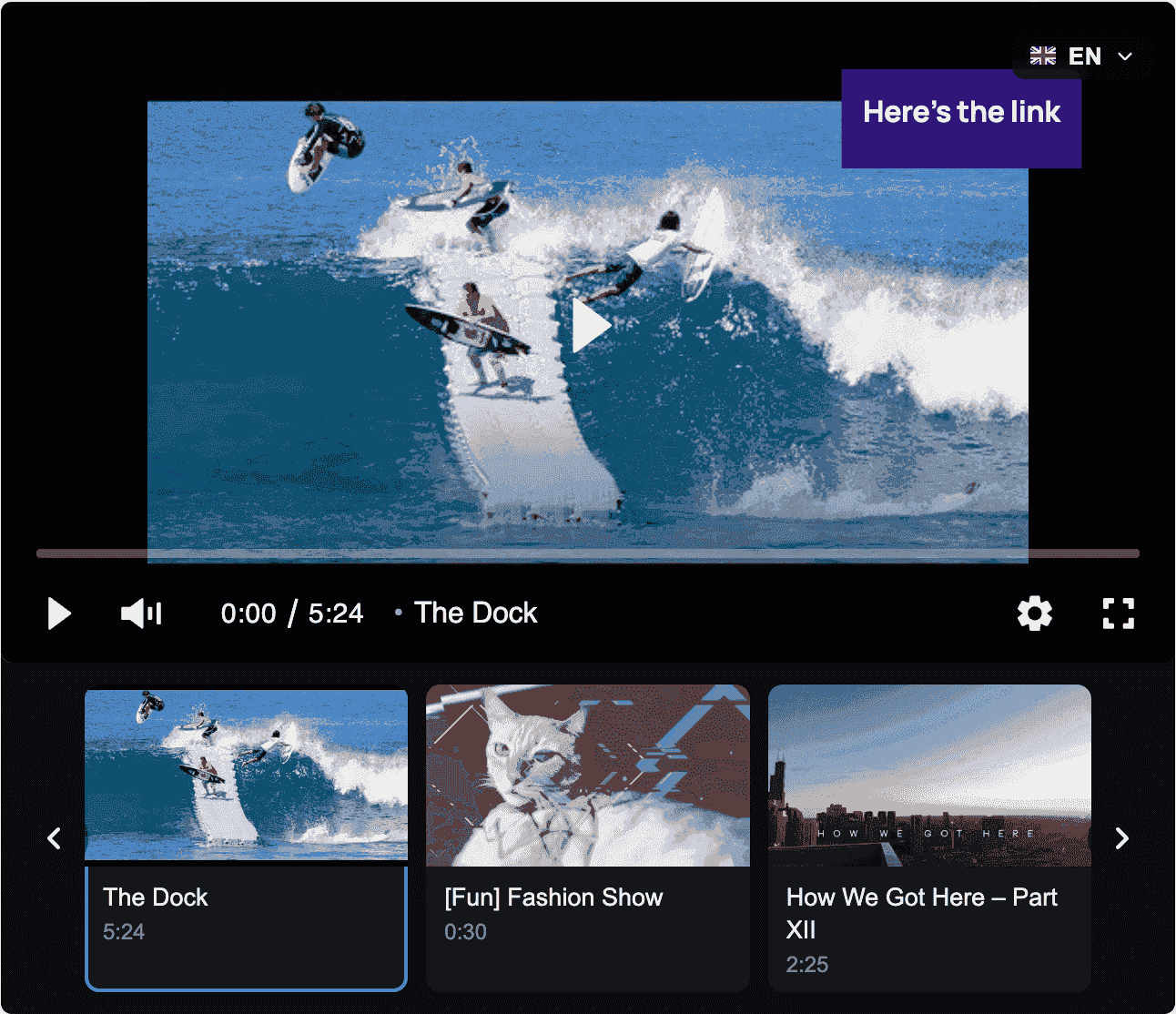
One item plays at a time, navigated by arrows, dots, or a thumbnail strip.
| Option | What it does |
|---|---|
| Slider type | Basic (carousel) — a single player navigated by controls — or Thumbnails — a scrolling strip of cards beside the player. |
| Side arrows | Shows previous/next arrows. |
| Dots | Shows pagination dots below the player. Basic carousel only. |
| Position | Below player or Above player. Thumbnails type only. |
| Items per view | How many thumbnails show at once, from 2 to 6. Thumbnails type only. |
| Show title / Show duration | Shown on the thumbnail cards. Thumbnails type only. |
Audio layout
Audio playlists always use the List layout, stacked above or below the audio bar.
| Option | What it does |
|---|---|
| Position | Below player or Above player only (no side or collapsed options). |
| Show numbers | Shows the track index. |
| Show album art | Shows each track's artwork. |
| Show duration | Shows each track's length. |
Keep audio titles short enough for mobile screens. If titles are long, use clear episode numbers or module prefixes so listeners can scan the list quickly.
Style
Each layout's settings drawer has two tabs: General (the options above) and Style. Style colors apply to the whole playlist — set them once and they carry across layouts. Every field is empty by default, which keeps the built-in dark look; set a value to override it.
The Style tab shows only the fields that make sense for the current layout:
| Field | What it themes | Layouts |
|---|---|---|
| Panel Bg | Background of the list panel (List) or the rail/strip (Grid, Slider — Thumbnails). | List, Grid, Slider (Thumbnails) |
| Header Bg | Background of the list's header bar. | List only |
| Text | Item title text. | List, Grid, Slider (Thumbnails) |
| Secondary Text | Item index and duration. | List, Grid, Slider (Thumbnails) |
| Active / Hover Bg | Highlight behind the active and hovered item. | List, Grid, Slider (Thumbnails) |
| Item radius | Corner rounding of item rows/cards, 0–40px. | List, Grid, Slider (Thumbnails) |
| Spacing | Gap between list rows, 0–24px. | List only |
| Background | The bar behind the player. | Slider — Basic carousel |
The Basic carousel has no list or cards, so its Style tab shows only Background.
Colors accept any CSS color, including semi-transparent rgba() values — useful for tinting the panel over the page without fully hiding it.
Layout checklist
Before publishing a playlist, check:
- The first item is the intended default item.
- The list order matches the expected viewing or listening sequence.
- The layout works on mobile and desktop.
- Posters and titles are consistent across all items.
- Private media uses the same access strategy across the playlist.
- Imported provider items have the correct thumbnails and titles.
Recommended patterns
| Use case | Recommended layout |
|---|---|
| Online course module | List with a side position on wide pages, below the player on narrow ones. |
| Podcast or audio archive | List (audio) with the track list below the player. |
| Product demos | Grid with strong poster images. |
| Featured / spotlight reel | Slider (Basic carousel) so one item plays at a time. |
| Episode browser | Slider (Thumbnails) for a scrollable strip beside the player. |
| Music album | List (audio) with the track list below the player. |
Related
- Playlist editor — create, import, order, and publish playlists
- Media — manage the media records inside playlists
- Video inspector panels — configure individual video items
- Access control — protect restricted playlist content